At the time of writing this line, Google fonts had 37,926,883,824,759 views. That is almost 38 trillion, with a T.
Context:
If you haven’t tried building websites or apps, you might have not heard of Google Fonts. Your operating system, say Windows 10, comes preloaded with a few fonts. If you want more new fonts, you download and install them. Once you have them installed on your computer, you can start using them in different programs including Word, PowerPoint etc.,
Now let’s say you want to show different fonts on your website or your android app, Google fonts can help you do that.
A little history of fonts in computers before we continue. If you are old enough, you’d know that computers didn’t’ always have graphical user interfaces. Apple was the first company to make GUIs mainstream and with its very first graphical operating system, they introduced the ability to choose different fonts (mainly because Steve Jobs was interested in calligraphy). From there, Windows operating system implemented that as well, and since then both operating systems have expanded their default stock of fonts that come preloaded. At the time of writing this article, Windows 10’s base install has 93 typefaces and 171 fonts, while macOS 10.14 Mojave comes with 180 typefaces and 488 fonts preinstalled.
Google Fonts is the most popular way to implement different fonts on your websites and apps. They have fonts in over 135 languages. I couldn’t find the exact number of fonts they have, but it is more than 987 font families. Now with the proliferation of internet and mobiles, Google fonts have become an inevitable part of our daily life and as a testament to that, they’ve served over 37,926,883,777,619 font views at the time of writing this line, notice the difference between the first line and this, it is mindboggling.
On March 3rd, Google Fonts celebrated 10 years and I wanted to try something to appreciate their contribution.
Idea:
While ideating for the cover image of volume 30.2 of Atlantis magazine (Quarterly journal by Polis, the student association of urbanism, landscape and EMU students at TU Delft), I had proposed a certain idea. The theme for that edition was global dreams and I suggested that we could get people of different nationalities to draw the world map and overlay it. This is to be done in a standardised paper so as to make it easier to overlay and because most people know their country and their neighbouring countries better than others, there would be a world map which is quite interesting, which would represent the varied perspectives of people towards a ‘global dream’. My colleagues Stefano and Lucas developed it further to create a slick cover. Take a look at the issue online, there is an article inside explaining the process too.
So, now the idea was to implement something similar for Google fonts. Get the outline of the fonts, and overlay them. Easy said than done.
Process:
As mentioned above, Google fonts have a shit ton of font options. Getting every single font and overlaying it would be an arduous process and I don’t know enough coding to automate the process and I was to manually try this.
In statistics, there is something called Power law. The distributions of a wide variety of physical, biological, and man-made phenomena approximately follow a power law relation over a wide range of magnitudes.

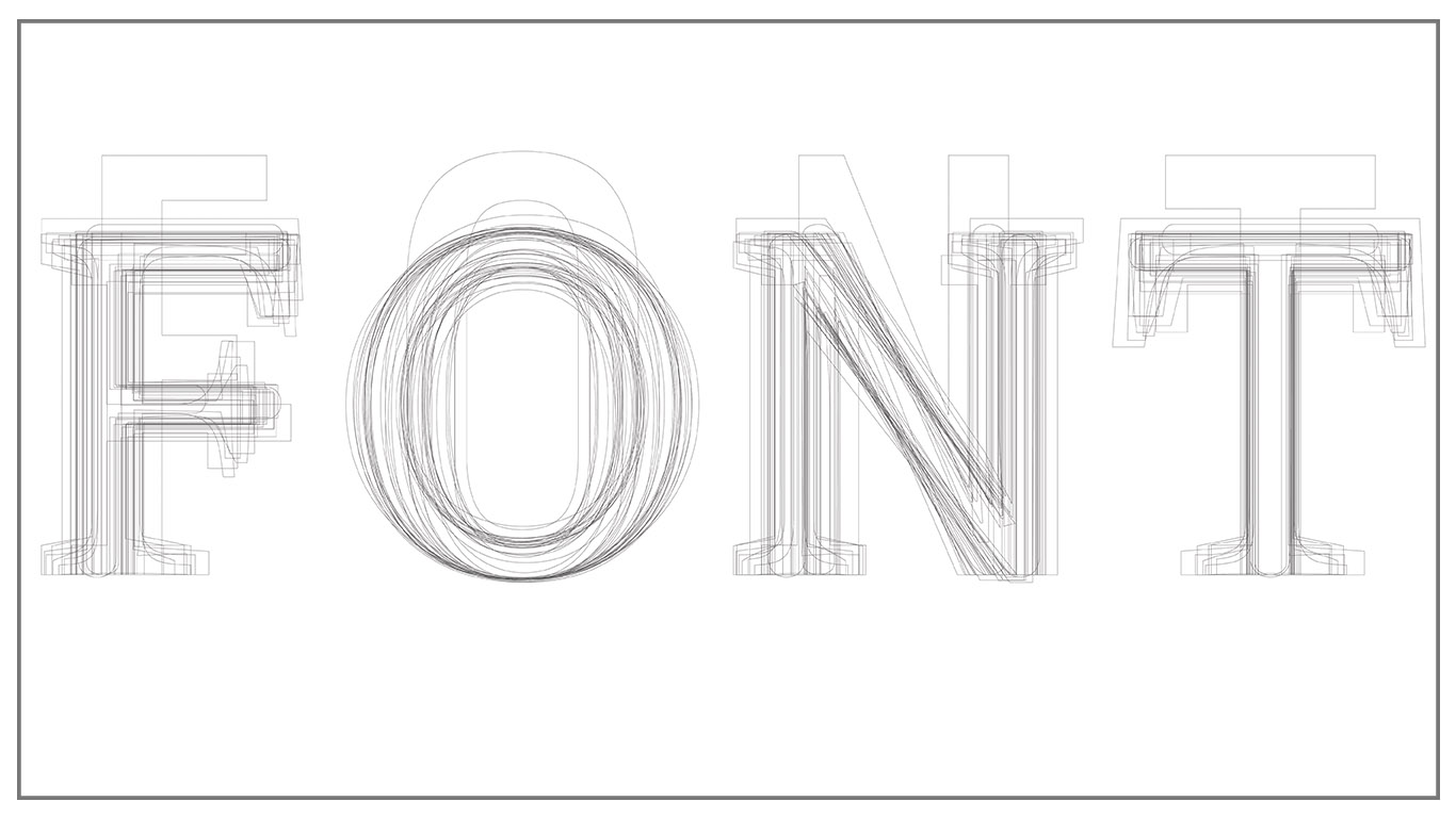
The same goes for Google Fonts too. Though they have a total of 37 trillion font views, the top 28 font families with over 100 billion views have a combined total of 32 trillion views. So I chose to focus only on them. So, the next complexity is that within each font family, there are different fonts. As seen in the image below, the Roboto font family has 12 distinct fonts within it. To further reduce complexity, I chose to go only with the regular fonts of the 28 font families.

Then it was pure grunt work. I downloaded the fonts that I didn’t have( I had used 50% of the fonts previously, so I had them installed already), added them on illustrator. Aligned individual characters vertically and horizontally and then created outlines of them. Voila!


There are so many interesting observations to be made. Though I was expecting a motley of unrecognisable scribbles, most of the characters were still readable. I’m assuming that is due to the lack of huge disparities between the most popular fonts, as people would prefer tame fonts over wild ones for mainstream usage. A version with the longtail of Google Fonts would probably produce a more inconsistent result.
In this, I, L and T show the varying serif slabs perfectly, While Q’s tail shows the inherent possibilities within font design. Oswald stands out amongst the sans serif fonts distinctively because of its height. Let me know if you see something interesting. Feel free to download and share. I would appreciate credits though! 😀
If you want to explore it on your own and want access to the files, reach out and I’ll mail you the illustrator files.
Cheers!